Monday 31 October 2016

School Magazine cover


For my school magazine I wanted to make it look as interesting as possible. My masthead is black and white which stands out and represents the colours of the school. Above it I put a statement saying "outstanding from Ofsted" which pulls the reader in and makes them want to read why exactly the school got outstanding. the top right hand corner I put a star burst pug in to attract the reader but if they want to no more they have to look inside, I made it white and red around the blue righting so it goes with the colour theme but the blue writing stands out so it shows importance. The subheadings are in pink. I also put a picture on with a subheading about prom king and queen in bright yellow bold writing which also draws the reader in.
The main image is of a student reading a book, I placed it on the right hand side of the magazine so I could put taglines around it. She's reading a book and she is looking down at the book which shows she's learning and it also shows she's not directly in the article she's just a face for it. At the bottom there is a banner with more things people can find inside which may appeal to a wider audience.

Monday 17 October 2016

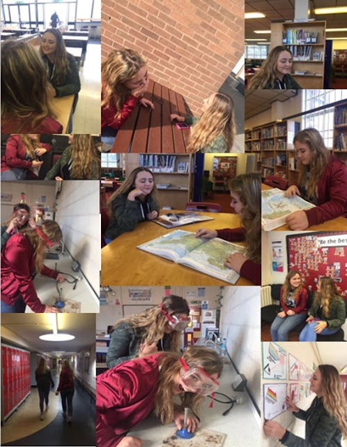
Thumbnails/ photogaphy for school magazine


These are the pictures I took as  practice for my school front cover. We took pictures in various different places around the school and took pictures of us doing school things like reading, learning, lessons and socialising, we worked as a team and positioned ourselves around the camera and the camera angles. we used mainly head shots, mid shots and over the shoulder shots so we could still see the environment we are in.

For my real front cover, I will take a picture of either a group of students in a classroom doing practical work e.g. science experiments or one student doing revision in a library because it shows that you can still enjoy your self while learning and being at school, and also the reality of school. I will also be thinking of different camera angles and also lighting so I can get the perfect photo.

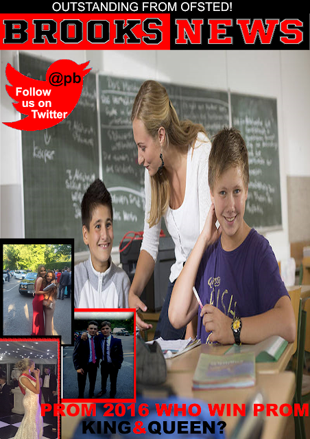
My Mock school&Music magazine covers


For the first magazine I used a close up of a school boy and placed him in the middle looking at the camera which shows this magazine is aimed at the person reading it and also that its about school as he is in uniform. I placed my masthead at the top of the front cover so it stands out to the reader,I put a plug in the top left hand corner to grasp the readers attention and to show them something fun that is in the magazine, I but my subheadings in the centred left to show what is in my magazine and finally at the bottom i put a banner to show more things that will be featured in my school magazine. The second school magazine i used a picture of a teacher teaching two students looking happy which shows its a school magazine but that its happy and has a good vibe, I placed the masthead at the top so it stands out with a subheading above it to grasp the readers attention, I Placed at the bottom left hand corner 3 pictures of prom with a subheading to get the reader interested and to make my magazine look even more interesting. For my school contents page I kept with the theme of red, white and black to make it stick with the school colours and my masthead colours so it stands out, I put on the right hand side what is featured in the school magazine with numbers so the reader can clearly see what they want to read and get to the page easily, On the left hand side I put some pictures that go with whats featured in the school magazine to give the readers a visual representation of what the features are going to be about.